 "HFV has no HFV. But somehow has 2 motorcycles" (hondasfordsvolvo)
01/28/2019 at 15:10 • Filed to: None
 1
1
 6
6|
"HFV has no HFV. But somehow has 2 motorcycles" (hondasfordsvolvo)
01/28/2019 at 15:10 • Filed to: None | 1
| 6 |
Or do the Ns on this engine start button look like open throttle plates.
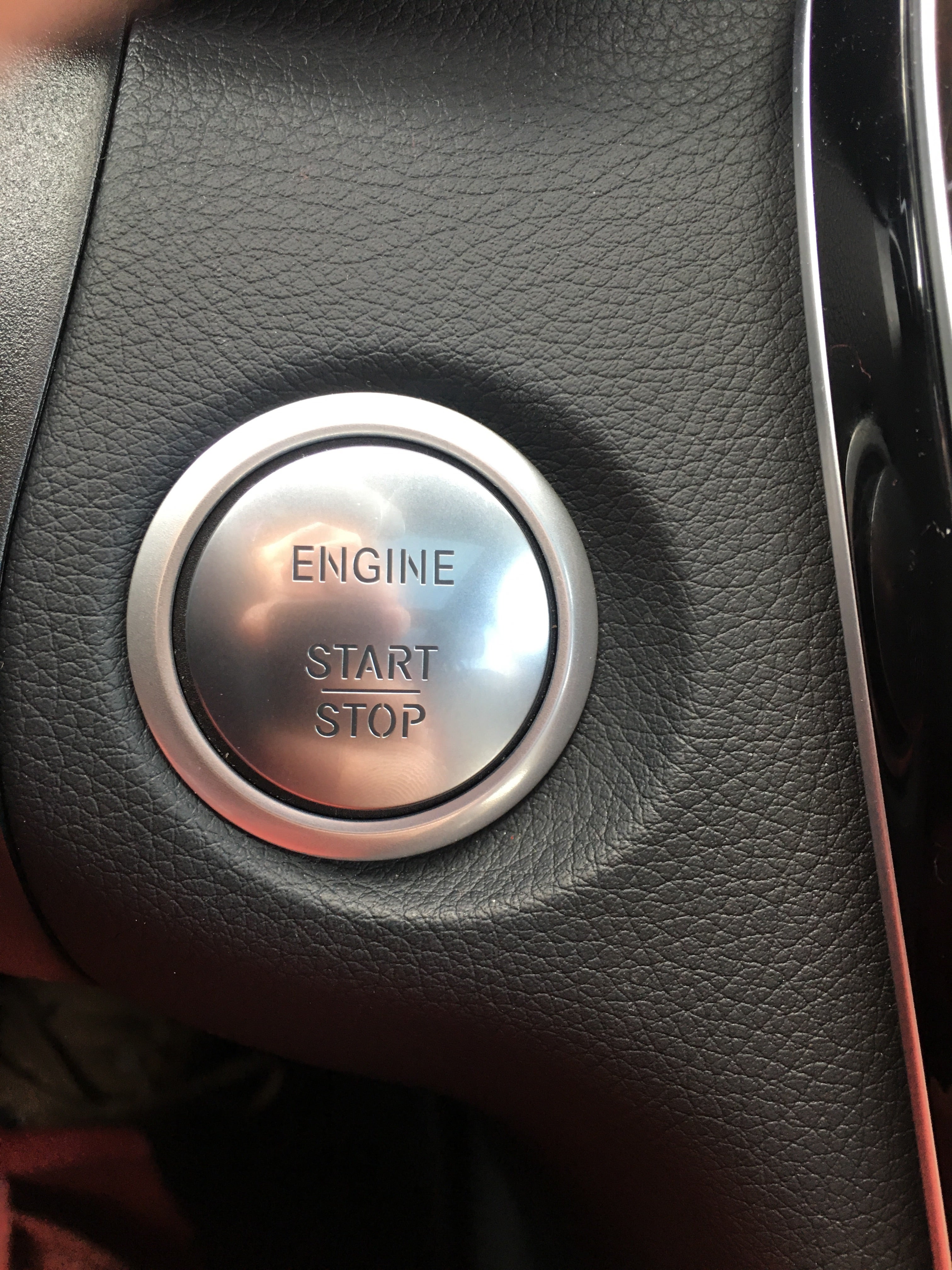
Maybe I’m giving Mercedes too much creative credit but I like the idea a lot
 Dash-doorhandle-6 cyl none the richer
> HFV has no HFV. But somehow has 2 motorcycles
Dash-doorhandle-6 cyl none the richer
> HFV has no HFV. But somehow has 2 motorcycles
01/28/2019 at 15:20 |
|
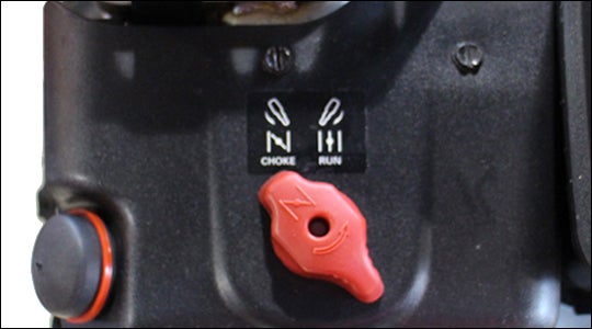
kind of look like the symbol for “choke”
 RamblinRover Luxury-Yacht
> HFV has no HFV. But somehow has 2 motorcycles
RamblinRover Luxury-Yacht
> HFV has no HFV. But somehow has 2 motorcycles
01/28/2019 at 15:23 |
|
Hard to say. A quick image search seems to suggest that connecting lines through the post is most common for a serif font stencil and through the bar is quite common for a sans font stencil (like this), so it might be deliberate or it might be that they just have a cheesy font.
To whit: I have no idea why the G in the font doesn’t have bridge lines, and if it were a real stencil, I’m quite sure it would - but they’ve got lines to the suspended fields on the A, P, O, and R just like a real stencil ...
The only real-world application I could see for a stencil that has equal volume cutouts (S and N) but only bridges the ones with sharp ends to reinforce them and not a huge suspended field like the G would be if the process was “fragile” or had a lot of burning in from the edge and the stencil was rigid . Like a lithography process or something.
 vicali
> RamblinRover Luxury-Yacht
vicali
> RamblinRover Luxury-Yacht
01/28/2019 at 15:33 |
|
I raise my cup to you;

|
HFV has no HFV. But somehow has 2 motorcycles
> Dash-doorhandle-6 cyl none the richer
01/28/2019 at 16:14 |
|
Yeah that’s what I was thinking of.
|
Dash-doorhandle-6 cyl none the richer
> HFV has no HFV. But somehow has 2 motorcycles
01/28/2019 at 16:16 |
|
gotta be 40 years too new to be the “choke” on a benz
|
HFV has no HFV. But somehow has 2 motorcycles
> Dash-doorhandle-6 cyl none the richer
01/28/2019 at 16:37 |
|
Doesn’t mean it can’t be some designer having fun with it